Introduction
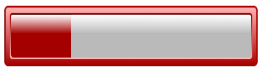
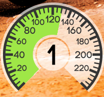
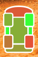
Filled Renderer is a renderer, that fills the space with a texture. This is the most basic, and yet the most common way of create progress bars. Here are some examples of filled bars:
Usage
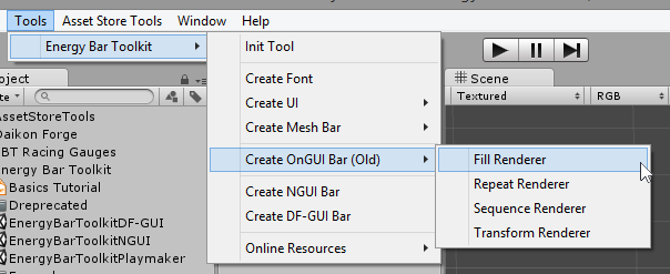
The simplest way to create your Filled bar is to execute Tools → Energy Bar Toolkit → Create OnGUI Bar (Old) → Fill Renderer from the main menu. This method creates an GameObject with renderer script attached and ready to work with:
The second way is to attach renderer script to existing GameObject. You’ll find Filled Renderer script in Your Project view. The path is Energy Bar Toolkit/Scripts/EnergyBarRenderer:
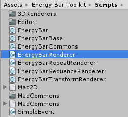
Then drag it to desired GameObject or its Inspector.
Configuration
In order to make things more clear for the end-user, the Inspector of Energy Bar Renderer is split to 4 different sections: Textures, Position & Size, Appearance, and Effects. Let’s start with…
Textures
This is the only mandatory section to setup before something will be visible on your Game View.
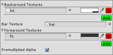
You are allowed to add any number of background and foreground textures. To add new texture just click the Add button. You can remove it later by clicking the X button. For each texture you can setup its tint.
- Background Textures (optional) – Textures to draw on the bottom layer.
- Bar Texture – Texture of bar itself (this one will be filling-up).
- Foreground Textures (optional) – Texture to draw on the top layer.
- Premultiplied Alpha – Tells that textures have its RGB components multiplied by alpha component. Read more at Premultiplied Alpha.
Position & Size
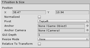
- Position – Where to place progress bar (from pivot point, by default it’s top-left corner).
- Normalized – If enabled these coordinates will be treated as normalized, where 0,0 it top-left, and 1,1 it bottom-right. The pivot point can be changed using pivot setting below*.
- Pivot – Pivot point.
- Anchor – Makes this energy bar follow selected GameObject. Read more.
- Anchor Camera – The camera on which anchor object is rendered. May be needed to set to determine the screen position of following object.
- GUI Depth – Sets the GUI.depth attribute to the desired value when painting this bar. Helps to set it above or under other GUI elements or bars.
- Resize Mode – Defines the resize mode of this bar (multiresolution-support). Available resize modes are:
- None – Do not resize the bar (will be displayed 1:1).
- Fixed – Set the fixed size. Won’t resize the bar is screen resolution changes.
- Stretch – Always set the bar size to given fraction of screen width and height. Works similar as normalized screen position.
- Keep Ratio – Allows to set only the bar height to screen height ratio. The bar width/height ratio will be preserved (won’t be stretched).
- Relative To Transform – By setting this option you can manipulate this bar position and size by Transform position and Transform scale. This makes possible to create hierarchies of energy bars in Hierarchy view and move or scale them as a group.
Appearance
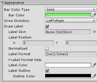
- Bar Color Type – Here you can select how to colorize your bar:
- Solid – One solid color.
- Gradient – Color that changes over bar value.
- Grow Direction – Which direction bar should increase to. Possible grow directions:
- Left To Right
- Right To Left
- Bottom To Top
- Top To Bottom
- Expand Horizontal – Expand horizontally starting from the middle
- Expand Vertical – Expand vertically starting from the middle
- Radial (CW or CCW) – When enabled it comes with two more options
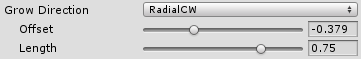
- Offset – Angle of where filling should start (1.0 means one full rotation CW starting from positive y, so -0.25 means 90 degrees CCW)
- Length – Angular length of fill (same rule as above: 0.75 means 270 degrees).
- Color Change – Always full fill, only bar color changes.
- Draw Label – Enables a label that is painted on top of this progress bar.
- Label Skin (optional) – Custom GUISkin with defined label style. Set this if you want to change label appearance.
- Label Position – Position of this label.
- Normalized – Will treat label position as normalized where 0,0 it top-left corner, and 1,1 is bottom-left cornet.
- Label Format – Format of the label. See description below.
- Label Color – Fill color of this label.
- Label Outline – Enables outline painting.
- Outline Color – Color of label outline.
Label Format Description
- {cur} – current int value
- {min} – minimal value
- {max} – maximum value
- {cur%} – current % value (0 – 100)
- {cur2%} – current % value with a precision of one decimal place (0.0 – 100.0)
Examples
- {cur}/{max} – 27/100
- {cur%} % – 27 %
Effects
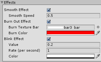
- Smooth Effect – Smoothly animated growing and shrinking.
- Smooth Speed – How fast this animation will be progressing.
- Burn Out Effect – Draw burn-out effect while bar value is decreasing.
- Burn Texture Bar – Bar texture to draw burn-out effect. Set this to None to use Bar texture set in Textures section.
- Burn Color – Color of burned bar.
- Blink Effect – Bar will blink to selected color if it’s value is below given Value.
- Rate (per second) – How fast blinking will goes.
- Color – Color to blink into. In most cases you will blink to full transparent.