Introduction
uGUI Filled Renderer is a uGUI renderer that allows you to create most generic, yet most powerful progress indicators of Energy Bar Toolkit.
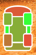
Filled means that it is all about filling the space. You can fill, left to right, right to left, bottom to top, top to bottom, expand in both directions from center, vertically, horizontally, fill circular or just change texture color based on gradient. Here are some examples:
Usage
You can create new uGUI Filled Renderer in three ways:
- Select Game Object → UI → Energy Bar Toolkit → Filled Bar from the main menu
- Select Tools → Energy Bar Toolkit → uGUI → Create Filled Bar from the main menu
- Click on the
 button in Hierarchy window, then UI → Energy Bar Toolkit → Filler Bar
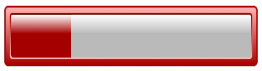
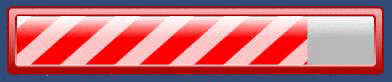
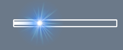
Either way, you will see a new shining bar on your scene:
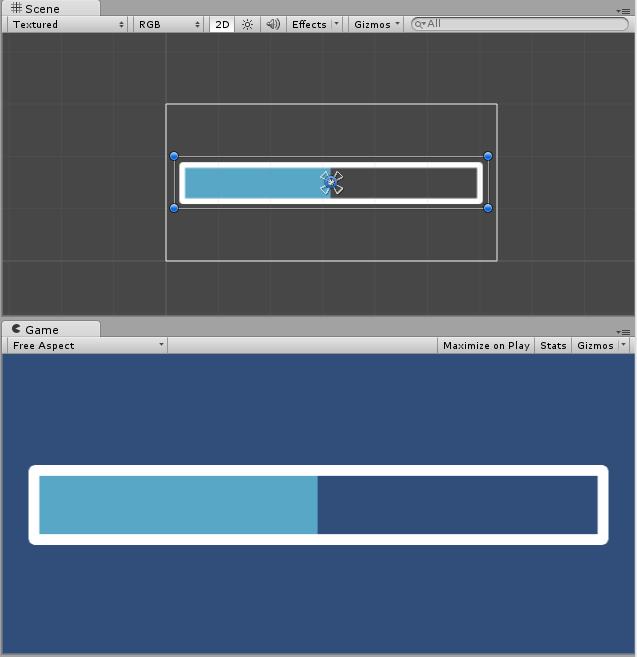
This component is created in a way to display something as soon as possible. By default it’s setup using bundled sprites that you probably would want to change:
Configuration
In order to make things easier Inspector of Energy Bar Renderer is split to 4 different sections.
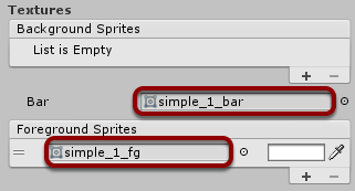
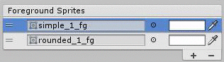
Textures
Here you can setup your textures.
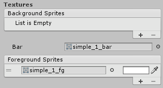
You are allowed to add any number of background and foreground sprites. To add a new sprite just click the + (add) button and you can remove it by selecting it and then pressing the - (remove) button. For each texture you can also decide about its tint. The tint of the Bar texture is configurable in the Appearance section.
- Background Textures – These sprites will be placed under the Bar texture.
- Bar Texture – Texture of bar itself.
- Foreground Textures (optional) – These sprites will be placed on top of the Bar texture.
Appearance
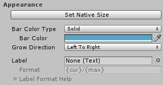
- Set Native Size – Click on this button to resize your bar to it’s native size based on used sprites.
- Bar Color Type – Here you can select how to colorize your bar
- Solid – One solid color.
- Gradient – Color that changes over bar value.
- Grow Direction – Which direction bar should increase to. Possible grow directions:
- Left To Right
- Right To Left
- Bottom To Top
- Top To Bottom
- Expand Horizontal – Expand horizontally starting from the middle
- Expand Vertical – Expand vertically starting from the middle
- Radial (CW or CCW) – When enabled it comes with two more options
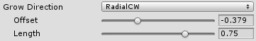
- Offset – Angle of where filling should start (1.0 means one full rotation CW starting from positive y, so -0.25 means 90 degrees CCW)
- Length – Angular length of fill (the same rule as above: 0.75 means 270 degrees).
- Color Change – Always full fill, changes only bar color.
- Label – Choose the uGUI Text object to be used as your bar label.
- Label Format – Format of the label. See description below.
Label Format Description
- {cur} – current int value
- {min} – minimal value
- {max} – maximum value
- {cur%} – current % value (0 – 100)
- {cur2%} – current % value with a precision of one decimal place (0.0 – 100.0)
Examples
- {cur}/{max} – 27/100
- {cur%} % – 27 %
Effects
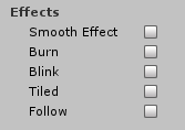
You have an access to variety of visual effects.
Smooth Effect
Makes the bar smoothly change its value.
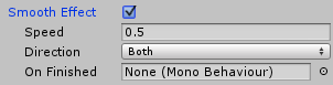
- Speed – Effect speed.
- Direction – When the smooth effect should be visible. The options are Only When Decreasing, Only When Increasing, and _Both.
- On Finished – Specify a object that message should be sent to, when the smooth effect finishes its animation. After assigning the object, you will be able to specify the method name as well.
Burn Effect
Shows the value burn effects. Similar to smooth effect, but displays the bar “shadow”.
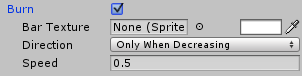
- Bar Texture – You can assign a sprite here if the texture should be different that currently used Bar texture.
- (Tint) – (Not labeled) Even if you won’t specify the texture, use the tint to change your burning bar color.
- Direction – When the smooth effect should be visible. The options are Only When Decreasing, Only When Increasing, and _Both.
- Speed – How fast this animation will be progressing. (This property is shared with Smooth Effect)
Blink Effect
Makes the bar blink when certain value has been reached.
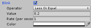
- Operator – Can be Less Than, Less Or Equal, Greater Than, and Greater Or Equal.
- Value – The comparsion value.
- Rate – The blinking rate.
- Color – The blinking color. In most cases you will want to set it to fully transparent.
If Operator is set to Less Than and Value to 0.2 bar will blink only when your bar value will drop under 20%.
Tiled Effect
Tiled effect is an effect that utilizes texture tilling and animation together.
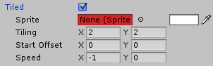
- Sprite – The tiled sprite1.
- Tilling – Repeat factor of this sprite.
- Start Offset – Texture offset on the first frame.
- Speed – Offset change over time.
1 Do not include this sprite in any sprite atlas or Texture Packer.
Follow Effect
Makes any game object follow the bar edge.
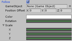
- GameObject – GameObject that should follow sprite edge. It may be a Image on the same Canvas.
- Position Offset – The offset of this game object in local space.
- Color – Tint gradient of following object. May change over time.
- Rotation – Rotation of following object. May change over time.
- Scale – Scale of following object. May change over time.
Debug
The debug section exists for mainly for debugging purposes. If you’re advanced Unity user and/or you will be having troubles of understanding the workings of Energy Bar Toolkit, then enable the debug mode. In debug mode Energy Bar Toolkit reveals all hidden game objects, that normally shouldn’t be seen or modified.