This rendering method is now deprecated. You can still use it, but it’s highly recommended to switch to uGUI.
Filled Bar is used to create bars that have filling-up gauges.
Example
Simple filled:

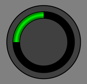
Circle filled:

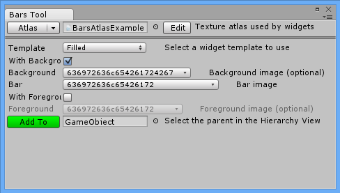
Bars Tool Configuration

- With Background – Background in filled is optional. Check this if you want to add background to Filled Bar.
- Background – Sprite for background.
- Bar – Sprite for bar (mandatory).
- With Foreground – Foreground is also optional. Check this if you want to add foreground to Filled Bar.
- Foreground – Sprite for foreground.
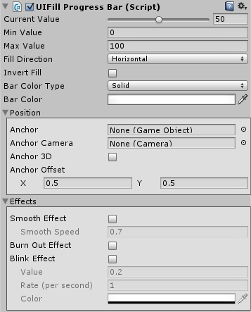
Inspector configuration

- Current Value – Current fill value.
- Min Value – Lower boundary fill value.
- Max Value – Higher boundary fill value.
- Fill Direction – horizontal, vertical, radial90, radial180, radial360.
- Invert Fill – Inverts fill direction set by above.
- Bar Color Type – Here you can select how to colorize your bar:
- Solid – One solid color.
- Gradient – Color that changes over bar value.
- Bar Color – Shortcut for setting bar Color Tint.
Effects
- Smooth Effect – Smoothly animated growing and shrinking. Good for health indicators.
- Smooth Speed – How fast this animation will be progressing.
- Burn Out Effect – When bar value is decreasing this will show shadow/burn effect.
- Burn Color – Usually it is red or original bar color with 1/2 alpha set.
- Blink Effect – When bar value will descend under Value it will start to blink.
- Value – Boundary for blinking.
- Rate (per second) – How quick blinking should be.
- Color – By default blinking is appearing and disappearing (alpha 0). You can change the desired color here.
