Introduction
Mesh Filled Renderer is a mesh renderer that allows you to create most generic, yet most powerful progress indicators of Energy Bar Toolkit.
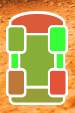
Filled means that it is all about filling space. You can fill, left to right, right to left, bottom to top, top to bottom, expand in both directions from center, vertically, horizontally, fill circular or just change texture color based on gradient. Here are some examples:
Usage
In order to create a new Mesh Filled Renderer bar select Tools → Energy Bar Toolkit → Create Mesh Bar → Filled from the main menu or Create → Energy Bar Toolkit → Mesh Filled Bar in the Hierarchy window.
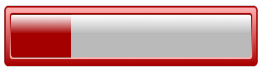
You should see the result immediately:
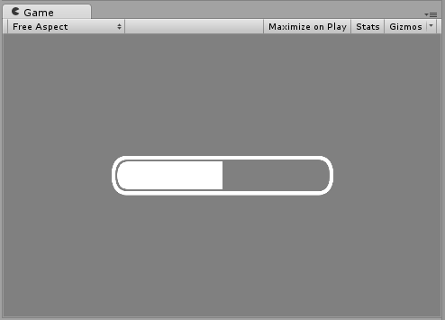
This component is created in a way to display something as soon as possible. By default it’s setup using stock graphics that you probably would want to change:
Configuration
In order to make things easier Inspector of Energy Bar Renderer is split to 4 different sections.
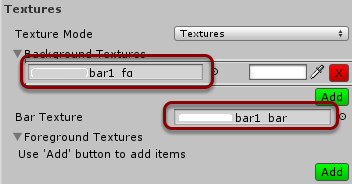
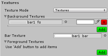
Textures
Here you can setup your textures.
You are allowed to add any number of background and foreground textures. To add new texture just click the Add button and you can remove it by clicking the X button. For each texture you can setup its tint.
- Texture Mode – Here you can choose if you want to use textures files or an atlas. If you want to reduce number of draw calls, you should read more about atlases.
- Background Textures (optional) – Textures to draw on the bottom layer.
- Bar Texture – Texture of bar itself.
- Foreground Textures (optional) – Textures to draw on the top layer.
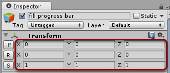
Position & Size
This section is responsible for where your bar will be displayed on the screen. Normally you would use the Transform properties to setup bar position, rotation, or scale:
Without an Anchor
This is how Position & Size section looks by default:
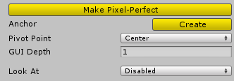
- Make Pixel-Perfect – Corrects bar position to be pixel-perfect.
- Anchor → Create – Creates an anchor for this bar, more information below.
- Pivot Point – The pivot point of this bar. By default it’s Center.
- GUI Depth – Adjust the draw order of this bar.
- Look At – Here you can define the facing of your bar. By default it is placed on 2D plane always facing the camera, but if you want to move it outside the panel then you might want to set it to one of these options.
- Disabled – Do not change the orientation
- Custom Object – You can set any Game Object to look at
- Main Camera – It will look at the camera with tag MainCamera.
Creating an Anchor
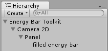
Creating and anchor will change your Hierarchy a little. It will put your current bar below Anchor object, that will be responsible to keep desired position regardless of screen resolution. Normally your Hierarchy will look like this:
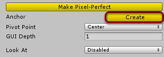
Then clicking on the Create button…
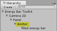
Will result in:
Anchor Mode – Screen Anchor
By default Anchor will be set in Screen Anchor mode, and Position & Size section will now look like this:
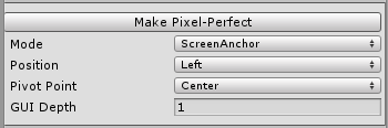
Screen Anchor allows you to place your bar relatively to screen edges, corners, and the screen center. It’s a great method of placing your bars at desired location regardless of screen resolution of your device.
Anchor Mode – Object Anchor
Object Anchor on the other hand will set your bar position to be relative to other GameObject that exists in the 3D space. In this way you’re able to create a health bar that will follow 3D object on your scene:
Usually GameObject that you would anchor to, should be new empty that is placed right below the character (yellow point) that should be followed. In this way your bar will always display in the right place regardless of the distance between character and the camera:
Let’s now look at the Inspector view:
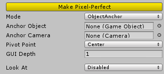
- Anchor Object – The GameObject that should be followed.
- Anchor Camera – If GameObject is rendered by different camera, you should set it here.
Appearance
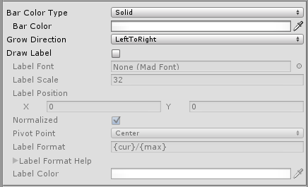
- Bar Color Type – Here you can select how to colorize your bar
- Solid – One solid color.
- Gradient – Color that changes over bar value.
- Grow Direction – Which direction bar should increase to. Possible grow directions:
- Left To Right
- Right To Left
- Bottom To Top
- Top To Bottom
- Expand Horizontal – Expand horizontally starting from the middle
- Expand Vertical – Expand vertically starting from the middle
- Radial (CW or CCW) – When enabled it comes with two more options
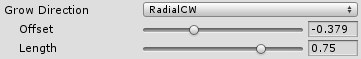
- Offset – Angle of where filling should start (1.0 means one full rotation CW starting from positive y, so -0.25 means 90 degrees CCW)
- Length – Angular length of fill (the same rule as above: 0.75 means 270 degrees).
- Color Change – Always full fill, changes only bar color.
- Draw Label – Draw label on top of your bar.
- Label Font – Font of the label created by Tools → Energy Bar Toolkit → Create Font.
- Label Position – Position of the label.
- Normalized – Normalizes label position from 0,0 (bottom-left) to 1,1 (top-right)
- Pivot Point – The pivot point of the label object.
- Label Format – Format of the label. See description below.
- Label Color – Fill color of this label.
- Label Outline – Draw outline for this label.
Label Format Description
- {cur} – current int value
- {min} – minimal value
- {max} – maximum value
- {cur%} – current % value (0 – 100)
- {cur2%} – current % value with a precision of one decimal place (0.0 – 100.0)
Examples
- {cur}/{max} – 27/100
- {cur%} % – 27 %
Effects
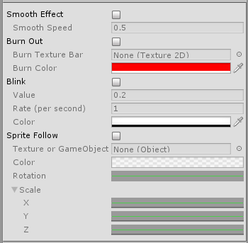
- Smooth Effect – Smoothly animated growing and shrinking.
- Smooth Speed – How fast this animation will be progressing.
- Burn Out Effect – Draw burn-out effect while bar value is decreasing.
- Burn Texture Bar – Bar texture to draw burn out effect. Set this to None to use Bar texture set in Textures section.
- Burn Color – Color of burned bar.
- Blink Effect – Bar will blink to selected color if it’s value is below given Value.
- Rate (per second) – How fast blinking will animate.
- Color – Color to blink into. In most cases you will blink to full transparent.
- Sprite Follow – Sets Texture or GameObject at the edge position of filling sprite.
- Texture or GameObject – Texture or GameObject that should follow sprite edge.
- Color – Tint gradient of following object. May change over time.
- Rotation – Rotation of following object. May change over time.
- Scale – Scale of following object. May change over time.
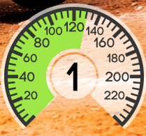
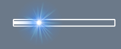
Sprite follow example (available in 3DBarsExampleScene):