Mesh Repeated Renderer is a mesh renderer that allows you to create bars from repeating icons (like hearts, coins).
Repeated renderer has many similarities to Mesh Filled Renderer. You can treat it as a set of small filled bars, that are joined together into one.
Creating
In order to create new Mesh Repeat Renderer select Tools → Energy Bar Toolkit → Create Mesh Bar → Repeated from the main menu or Create → Energy Bar Toolkit → Mesh Repeated Bar in the Hierarchy window.
You should see the result immediately:
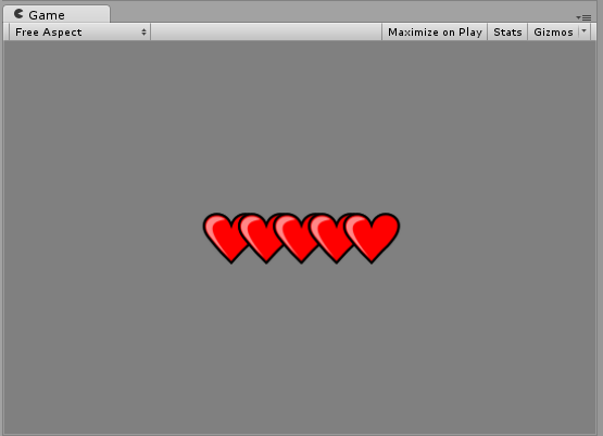
This component is created in a way to display something as soon as possible. By default it’s setup using stock graphics that you probably want to change.
Configuration
In order to make things easier Inspector of Energy Bar Renderer is split to 4 different sections.
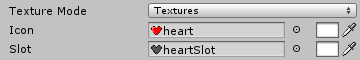
Textures
Here you can setup your textures.
- Texture Mode – Here you can choose if you want to use textures files or an atlas. If you want to reduce number of draw calls, you should read more about atlases.
- Icon – (required) The icon to repeat.
- Slot – An image that will be displayed in a place when icon may be visible.
Note the color setting to the right to Icon and Slot fields. Here you can set tint for those textures.
Position & Size
This section is widely described in Mesh Filled Renderer and it’s functionality is identical across all renderers.
Appearance
Here you can setup how your bar should appear to the user (except textures setup).
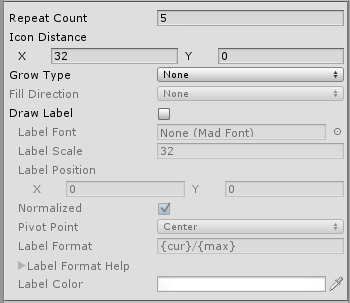
- Repeat Count – Defines number of repeats.
- Icon Distance – Distance (delta) between each icon repeat.
- Grow Type – Appearance type of icon growing.
- None – Display as it is, or do not display at all.
- Grow – Grow each icon from zero scale to original.
- Fade – Fade each icon from transparent to opaque.
- Fill – Fill it using direction setup below.
- Fill Direction – Enabled only when Grow Type is set to Fill. Here are possible fill directions:
- Left To Right
- Right To Left
- Bottom To Top
- Top To Bottom
- Expand Horizontal – Expand horizontally starting from the middle
- Expand Vertical – Expand vertically starting from the middle
- Radial (CW or CCW) – When enabled it comes with two more options
- Draw Label – Draw label on top of your bar.
- Label Font – Font created by Tools → Energy Bar Toolkit → Create Font.
- Label Position – Place where to draw label.
- Normalized – Normalizes label position from 0,0 (bottom-left) to 1,1 (top-right)
- Pivot Point – The pivot point of label object.
- Label Format – Format of the label. See description below.
- Label Color – Fill color of this label.
- Label Outline – Draw outline for this label.
Label Format Description
- {cur} – current int value
- {min} – minimal value
- {max} – maximum value
- {cur%} – current % value (0 – 100)
- {cur2%} – current % value with a precision of one decimal place (0.0 – 100.0)
Examples
- {cur}/{max} – 27/100
- {cur%} % – 27 %
Effects
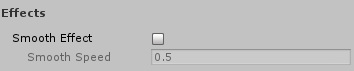
- Smooth Effect – Smoothly animated growing and shrinking.
- Smooth Speed – How fast this animation will be progressing.